People love what they know
I first got into computing in the late 1970s, at a time when most computer monitors were monochrome. They presented white (or green) text on a black screen. I suppose what you first learn becomes your "normal" and everything else that follows looks strange in comparison. I don't recall when it was that I first saw a "paperwhite" computer monitor (white background with black text), but I remember it looked as wrong to me as a Hawaiian shirt on a nun. Suffice to say that I have always been firmly in the "dark theme" camp.
Over the years, I've gone from Solarized Dark to Gruvbox Dark to Tomorrow Night Eighties to Monokai, with a lot of brief interludes in between testing other (dark) themes. But none of them ever felt exactly right. There was always something a little off in the way they looked, or how I had to squint my eyes ever so slightly to read certain text.
Part of this problem is admittedly medical, and probably not an issue for most. I experience what I can only refer to as "visual static." In very light or very dark environments my eyes overlay a red and blue static over my visual field. For those readers over the age of 30, the best way I can describe it is that it's like watching a poorly tuned analog TV station through a pair of drive-in movie 3D glasses. The brighter or darker the background the more pronounced it becomes - but it's always there to some degree.
On a white-on-black, or black-on-white terminal display - it is extremely noticeable and makes reading and processing visual information very difficult. Which is why the default terminal colors on just about any operating system make my eyes hurt after a short time. The exception would be Microsoft's Powershell (white-on-blue) but that one makes my soul hurt instead.
The low contrast themes try to reduce eye strain by avoiding the use of black and white. Instead, they use muted backgrounds and light, sometimes pastel, text colors. However, while such color schemes may reduce eye strain for some by lowering the luminosity and contrast of the display, I find my eyes straining to discern the foreground from the background. I suspect that most color schemes are created by young programmers with young eyes, not by 40-somethings who wear bifocals to use a computer.
So recently, I decided to test the "dark themes are better for your eyes" theory and try experimenting with light-colored themes. Having dabbled with these previously, I knew I would hate it at first. What I wanted to test was if I powered through the initial discomfort, would I be able to acclimate to using a light theme? And importantly, would a light theme provide any noticeable benefit in comfort or productivity (once acclimated) over using a dark theme?
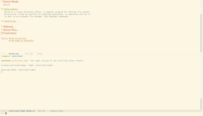
Having spent a lot of time using Solarized Dark, I first switched my terminal and editor to Solarized Light.

Unfortunately, I found that the same issue I had with pastel colors on Solarized Dark carried forward with Solarized Light. The background was just a little too pale, and the foreground color for normal text was ridiculously low contrast. Within just a few hours my eyes hurt like hell from squinting so much trying to read the light text on the pale, bright background color.
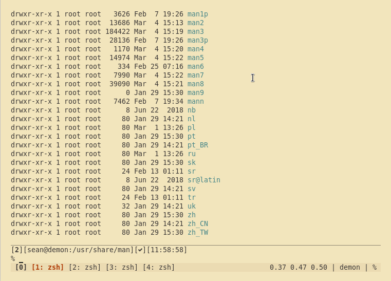
A big fan of Gruvbox Dark, I then changed my theme to Gruvbox Light Soft, and made a couple of minor tweaks to some theme elements to favor the darker colors in the set.

Gruvbox was a lot dimmer than Solarized. But at first, I still found my workspaces to be shockingly bright and I was put off by the very foreign appearance of commands and text flowing over a light background. And objectively, my monitor was putting out much more light. I generally keep a terminal maximized to one half of my 35" ultrawide display with a browser maximized on the other half. On a different virtual desktop, I keep Emacs maximized fullscreen. With a light theme in these large windows my monitor was a lot brighter than with a dark theme, and the glare was uncomfortable on my eyes.
The solution to this problem was stupidly simple - don't sit in the dark. I turned on a light in the room. While I was at it, I took off my evil hacker hoodie because I looked silly without the screen glow effect.
The addition of some ambient light immediately removed the ill effects of the increased luminosity of my screen! After that I noticed that my screen was as readable as a piece of (unbleached) paper. The tan/cream background of the Gruvbox Light theme largely reduced my visual static, and the dark gray text popped off the virtual page and was easy to read. Using the Soft variant gave me just the right amount of contrast without being too sharp and harsh.
Also, theme colors aren't the only thing that makes a difference. One thing that I noticed immediately when switching to a light theme was that I needed to change fonts. With a dark theme, I had chosen thicker font faces to more clearly illuminate the characters against the dark background. Thin font faces would look blurred or faded with such themes.
Now on a light background, the characters looked fat and swollen. I switched to a thinner terminal font (Adobe's Source Code Pro) and noticed an immediate improvement in readability. The narrow font faces were sharp and clearly legible against the light background.
The results of my experiment: within 24 hours I went from being a die-hard dark theme user, to being a happier and more productive light theme user. One who no longer finishes up a day's work with sore eyes and a mild headache.
All it required was the act of trying something different and overcoming my own normalcy bias.
Update: 2020-05-26
After over a year of using a light theme, I've once again succumb to the Dark Side and gone back to using my old standard: Gruvbox Dark. And you know what? Now I love it again. Go figure.
